Les graphiques 3D
Il est possible de réaliser des graphiques 3D sous python pour visualiser des courbes, des surfaces, des points ... dans un espace 3D.
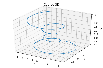
Courbe 3D
import matplotlib.pyplot as plt
from mpl_toolkits.mplot3d import axes3d  # Fonction pour la 3D
import numpy as np

# Tableau pour les 3 axes
# Création d'un tableau de 100 points entre -4*pi et 4*pi
theta = np.linspace(-4 * np.pi, 4 * np.pi, 100)
z = np.linspace(-2, 2, 100)  # Création du tableau de l'axe z entre -2 et 2
r = z**2 + 1
x = r * np.sin(theta)  # Création du tableau de l'axe x
y = r * np.cos(theta)  # Création du tableau de l'axe y

# Tracé du résultat en 3D
fig = plt.figure()
ax = fig.gca(projection='3d')  # Affichage en 3D
ax.plot(x, y, z, label='Courbe')  # Tracé de la courbe 3D
plt.title("Courbe 3D")
ax.set_xlabel('X')
ax.set_ylabel('Y')
ax.set_zlabel('Z')
plt.tight_layout()
plt.show()
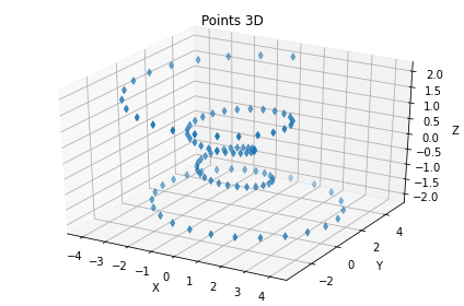
Points 3D
import matplotlib.pyplot as plt
from mpl_toolkits.mplot3d import axes3d  # Fonction pour la 3D
import numpy as np

# Tableau pour les 3 axes
# Création d'un tableau de 100 points entre -4*pi et 4*pi
theta = np.linspace(-4 * np.pi, 4 * np.pi, 100)
z = np.linspace(-2, 2, 100)  # Création du tableau de l'axe z entre -2 et 2
r = z**2 + 1
x = r * np.sin(theta)  # Création du tableau de l'axe x
y = r * np.cos(theta)  # Création du tableau de l'axe y

# Tracé du résultat en 3D
fig = plt.figure()
ax = fig.gca(projection='3d')  # Affichage en 3D
ax.scatter(x, y, z, label='Courbe', marker='d')  # Tracé des points 3D
plt.title("Points 3D")
ax.set_xlabel('X')
ax.set_ylabel('Y')
ax.set_zlabel('Z')
plt.tight_layout()
plt.show()
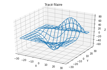
Tracé filaire
import matplotlib.pyplot as plt
from mpl_toolkits.mplot3d import axes3d  # Fonction pour la 3D
import numpy as np

# Tableau pour les 3 axes
X, Y, Z = axes3d.get_test_data(0.05)


# Tracé du résultat en 3D
fig = plt.figure()
ax = fig.gca(projection='3d')  # Affichage en 3D
ax.plot_wireframe(X, Y, Z, rstride=10, cstride=10)  # Tracé filaire
plt.title("Tracé filaire")
ax.set_xlabel('X')
ax.set_ylabel('Y')
ax.set_zlabel('Z')
plt.tight_layout()
plt.show()
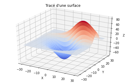
Tracé d'une surface
import matplotlib.pyplot as plt
from mpl_toolkits.mplot3d import axes3d  # Fonction pour la 3D
from matplotlib import cm
from matplotlib.ticker import LinearLocator, FormatStrFormatter
import numpy as np

# Tableau pour les 3 axes
X, Y, Z = axes3d.get_test_data(0.05)


# Tracé du résultat en 3D
fig = plt.figure()
ax = fig.gca(projection='3d')  # Affichage en 3D
ax.plot_surface(X, Y, Z, cmap=cm.coolwarm, linewidth=0)  # Tracé d'une surface
plt.title("Tracé d'une surface")
ax.set_xlabel('X')
ax.set_ylabel('Y')
ax.set_zlabel('Z')
plt.tight_layout()
plt.show()
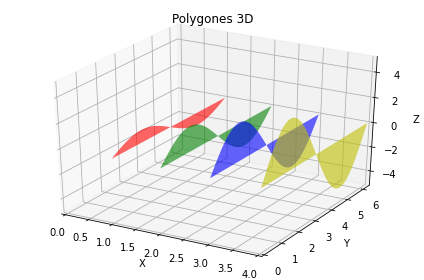
Tracé de polygones 3D ou courbes multiples
Permets de mettre côte à côte plusieurs courbes pour les comparer.
import matplotlib.pyplot as plt
from mpl_toolkits.mplot3d import axes3d  # Fonction pour la 3D
from matplotlib.collections import PolyCollection
from matplotlib import colors as mcolors
import numpy as np


def cc(arg):
    return mcolors.to_rgba(arg, alpha=0.6)


# Tableau pour les polygones
x = [1, 2, 3, 4]  # Points pour chaque polygone
y = np.linspace(0, 2*np.pi, 100)  # Création du tableau pour l'axe y

# Construction de chaque polygone pour les différents points de x
z = []
for xs in x:
    z.append(list(zip(y, xs*np.sin(y))))  # Axes (y,z)

# Création de la collection de polygones
poly = PolyCollection(z, facecolors=[cc('r'), cc('g'), cc('b'),
                                     cc('y')])
# Tracé du résultat en 3D
fig = plt.figure()
ax = fig.gca(projection='3d')  # Affichage en 3D
ax.add_collection3d(poly, x, zdir='x')  # Tracé des différents polygones
plt.title("Polygones 3D")
ax.set_xlabel('X')
#ax.set_xticks(x,('Un','Deux','Trois', 'Quatre'))
ax.set_xlim3d(0, 4)  # Limites pour l'axe x
ax.set_ylabel('Y')
ax.set_ylim3d(0, 2*np.pi)  # Limites pour l'axe y
ax.set_zlabel('Z')
ax.set_zlim3d(-5, 5)  # Limites pour l'axe z
plt.tight_layout()
plt.show()
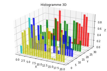
Histogramme 3D
Le tracé d'un histogramme 3D se construit barre par barre dans une ou plusieurs boucles for.
import matplotlib.pyplot as plt
from mpl_toolkits.mplot3d import axes3d  # Fonction pour la 3D
import numpy as np

# Tracé du résultat en 3D
fig = plt.figure()
ax = fig.gca(projection='3d')  # Affichage en 3D

# Construction des histogrammes et affichage barre par barre
for c, z in zip(['r', 'g', 'b', 'y'], [30, 20, 10, 0]):
    x = np.arange(20)
    y = np.random.rand(20)

    # On peut définir une couleur différente pour chaque barre
    # Ici la première barre est en cyan.
    cs = [c] * len(x)
    cs[0] = 'c'
    ax.bar(x, y, z, zdir='y', color=cs, alpha=0.8)  # Ajout d'une barre

plt.title("Histogramme 3D")
ax.set_xlabel('X')
ax.set_ylabel('Y')
ax.set_zlabel('Z')
plt.tight_layout()
plt.show()